PSD to HTML conversion produces higher-quality, reusable front-end code when it is done manually rather than with automatic conversion tools.
Choose manual PSD to HTML conversion when code quality, responsive behavior, scalability, and reusable components are project priorities
Use Figma for new projects and PSD to HTML for legacy Photoshop-based workflows or existing agency pipelines
Expect design complexity to have a greater impact on PSD to HTML cost than responsiveness or the number of unique elements
Prepare organized PSD files with named layers, documented fonts, colors, spacing, responsive behavior, and exported assets before handoff
Verify PSD to HTML deliverables with pixel-perfect comparison, cross-browser and cross-device testing, markup validation, responsiveness testing, and functionality checks
In this post, we will demonstrate to you how to convert PSD to HTML based on a simple Web 2.0 design example. To convert our design, I will apply modern solutions using CSS3, HTML5, and Flexbox Layout. Feel free to familiarize yourself with all the features of Flexbox here.
I will not be using any frameworks such as Bootstrap or Tailwind CSS. I will simply show you how to transform your PSD to HTML step by step.
Let’s Convert PSD to HTML Together
PSD to HTML Conversion: Part 1 (the Header)
A website header is a crucial element located at the top of every webpage. It’s the first thing visitors see when they land on your site, making it an essential component in creating a strong first impression.
When building the header of our web page, we’re going to take these and other steps:
In this PSD to HTML tutorial, you will need a text editor that can highlight code (I prefer Sublime) and a graphic editor where you will do most of the work. (I will be using Adobe Photoshop, which works best for opening files in a .psd format)
First off, open the designs in Photoshop.
Create a new directory with a project name. Inside, create two more directories: CSS (for your CSS files) and images (for your images).
Now, let’s write this simple code in index.html. You will find it in most HTML slicing projects.
Here I have added <!DOCTYPE html> that will notify the browser that this is HTML5. I have specified the site’s title inside the tag <title></title> and linked the file to style.css, which is in the CSS directory. Now I have the following tag with two attributes <link rel=”stylesheet” href=”css/style.css”>.
Type the words “Sample text” between the <body> and </body> tags.
Open the index.html in a browser (I prefer Google Chrome). You should see the following text in the browser: “Sample text.”
Now take a look at the designs and try to define separate areas.
At the top you’ll see a black bar with a logo and navigation menu. You can call it .header.
Then you will see a block with a big image and some promo text. Let’s call it .hero.
In addition, there is a white area with the main content. I prefer calling it .main but you can choose any title you find suitable.
The last block will be labeled as .footer.
All the content is centered. The first two blocks and the footer are stretched across the whole width of the screen. The main content on the white background has the same width as the stretched areas do.
Since the blocks with content and not their visuals (the dark background and hero image) have the same width, you can use containers of the same width to center them. Let’s start with the HTML code for the main blocks.
<!doctype html>
<html lang="en">
<head>
  <meta charset="utf-8">
  <title>Insight</title>
  <link rel="stylesheet" href="css/style.css">
</head>

<body>
    <header class="header">
        <div class="container">
            header is here
        </div>
    </header>

    <section class="hero">
        <div class="container">
            hero content is here
        </div>
    </section>

    <main class="main">
        <div class="container">
            middle content is here
        </div>
    </main>

    <footer class="footer">
        <div class="container">
            footer is here
        </div>
    </footer>
    </body>
</html>
First, let’s use Normalize.css to reset all tag properties. To do that, just copy and paste the code to the top of the CSS file. Then add the following CSS code. You can read more about it here.
Now, remove underlines from the links since they are not underlined in the design.
a {
    text-decoration: none;
}
For frequently used colors in the layout, we will use CSS custom properties or CSS variables. Let’s add them via the inline tag <style> at the end of the tag <head>.
They are often added as we cut our layout but I selected this set by going through all the colors and then using them in the code. What benefits do CSS variables bring us in contrast to standard color specification in CSS code? We can easily change and customize our colors without editing the CSS code itself.
In fact, there are many more advantages to this approach but let’s just stick to the basics in this PSD to HTML conversion guide. This is an example of using variables in the CSS code:
/* specify the value of the variable */
:root {    --example-color: #fff;}
/* We use a variable in the code that can be applied to an unlimited number of selectors. The value changes in one place and is applied to all selectors that use this variable. */
.example-selector {
    color: var(--example-color);
}
.example-selector-2 {
    color: var(--example-color);
}
In Photoshop, measure the width of the main content by selecting the “Rectangular Marquee Tool” or pressing M.
On the information panel or by the cursor point, you will see that the width is 1140px. Now you know the width of .container.
If you take a closer look at the design, you’ll notice that the header and footer have the same checked texture in the background. Disable the grid by pressing Ctrl + H and zoom in on the design to find the repeating element of the texture. Select and copy it to the buffer by pressing Ctrl + Shift + C.
Then create a new document, paste the texture there, and save it for the Web with the following combination: Ctrl + Alt + Shift + S. Choose preset – JPEG High and set the quality to 60% then click “Save”. In the pop-up, select the images folder. Name the image bg-texture.jpg. Then enable the Eyedropper Tool and click on the footer. Now you have the code for the color of the dark blocks which you’ll specify in styles so that these areas are a dark color while the image with the texture hasn’t been uploaded yet.
Here you have added the image and placed it in the middle of the block by absolute positioning and specifying 100% width and height. The property object-fit: cover; tells the browser to stretch the image to its maximum size by either width or height. You can learn more about this property here.
You may notice that our image overlaps the content. To fix this, we will raise the container above the image on the stack by adding the following properties:
I gave the class .slogan to the site slogan and added the navigation as a list of links wrapped in the HTML5 tag nav.
At this point, here is what you should be seeing in the browser:
Now it’s time to create styles for these elements. Measure the top and bottom margin between the logo and the top of the page in Photoshop. The CSS code will look like so:
.logo {
    margin: 19px 18px 14px 0;
}
The property float: left; is necessary to wrap further elements around the current one.
Now style the slogan:
The font family is “Times New Roman”, size 16, italic lettering and white color with an opacity set to 35%.
Let’s move to the site navigation styling now. Each element has its own navigation icon. For icons, I prefer using the icon font icomoon. This resource allows us to use ready-made icon sets and at the same time add our own. Go to the icons section.
For this layout, icons from the Font Awesome set will suit us fine. To find an icon simply use the search feature. Let’s find the icons we are interested in by name and add them to our set with a simple selection. For this tutorial we will use social media icons for the footer.
Here’s what we should get:
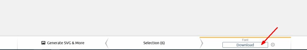
Next, click the Generate font button on the bottom panel.
Then download.
Save and unpack the archive. You will see the following set of files inside:
Copy the fonts folder with font files to our project folder. Then copy the code from the style.css file and paste it at the top of our style.css file. The only thing that remains for us to fix is the path to our font files. Add ../ at the beginning of the path for each file, and you are done.
Let’s continue converting PSD to HTML. Go back to our header and add icons to our navigation. In order for the icon to be displayed in the browser, you need to add a tag <i></i> with the appropriate class name. We can find the class name of each icon in the code that we added.
We will get the following html after adding the icons:
The next step of our PSD to HTML conversion process is writing the CSS code for the menu. First of all, reset the default styles for the tag <ul></ul>. We are interested in the outer margin and inner padding indentations and the markers themselves.
.nav {
    list-style: none;
    margin: 0;
    padding: 0;
}
Since it is a list and its items are arranged vertically by default, you need to wrap them using flexbox by applying these properties to the parent .nav. Each menu item has a gray border to the left, so set border-left: 1px solid #2c323d; for each element. The last element also has a right border and uses the :last-child pseudo-class to add a border to it.
Let’s put our elements in place in the .header itself. In order to do this, apply flex-box to the .container of our header because it is the parent of the rest of the elements.
At this point, we see that our slogan is not quite in place. Using a simple fix in combination with a flexbox, we add a margin-left: auto; rule to our .header nav tag, which gives us the desired result.
Everything should be looking fine now.
Now let’s get the menu styled. Set the white color to the links, specify margins (I applied display: block; to the links to increase the area of those), and remove underlines from the links.
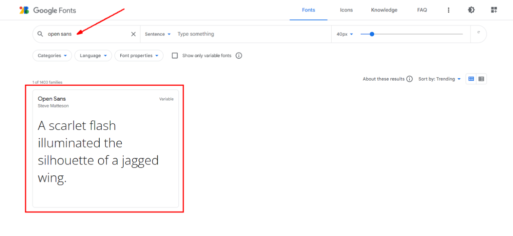
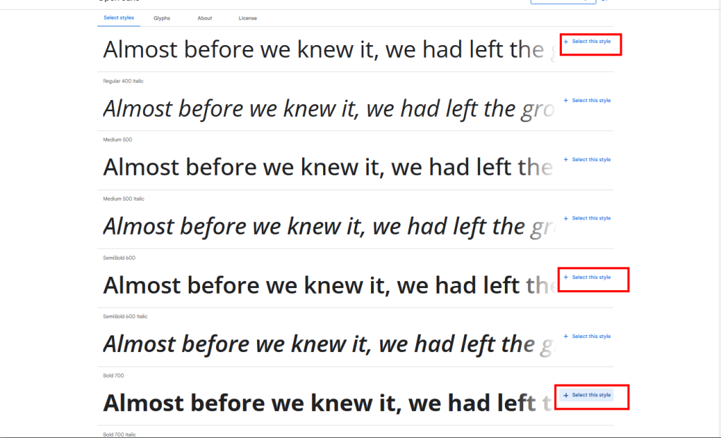
Now you can use this font in your CSS with font-family: ‘Open Sans’, sans-serif;. Since it is the main font on the page and the menu according to the design, you can set this font family for the entire document. Also, you can define the main color and set the font size to 16px.
Refresh the browser to see the updates. It is not that hard to convert PSD to HTML after all is it?
Set the hover state for the menu link.
.nav a:hover {
    background-color: #13151a;
}
Now add your buttons. Just add position: relative; to the tag <a> and encode the icons with the icons font.
.nav a i {
    position: absolute;
    top: 21px;
    left: 24px;
    font-size: 20px;
}
You now have the following menu displayed in the browser:
PSD to HTML Conversion: Part 2 (the Hero Section)
A hero section is a large section placed at the top of a web page. It provides a succinct overview of the site’s content and purpose, encouraging visitors to explore further. When handling the hero section of our web page, we’re going to do the following, among the rest:
Add content to the hero block
Style the hero block
Add buttons with rounded corners
Let’s proceed with the section .hero. Add the content of this block to your HTML. You have a headline, one paragraph of text, and two buttons with the same style but different colors.
The HTML is set up as follows:
<div class="hero">
    <div class="container">
        <h1>Don't ignore your dreams</h1>
        <p><strong>The 5 regrets</strong> paint a portrait of post-industrial man, who shrinks himself into a shape that fits his circumstances, then turns dutifully till he stops.</p>
        <a href="#" class="btn btn--green">See how it works</a>
        <a href="#" class="btn btn--blue">Join us</a>
    </div>
</div>
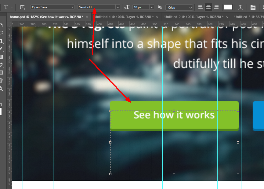
Now write the styles for the header and paragraph. Measure the size and thickness of the text, indentations and line heights in Photoshop. Since all the text in the block is white and located in the center, add color: #fff; and text-align: center; to .hero.
Now I will show you how to add the buttons. I created them as an <a> tag with the general class .btn, where I will add general styling. I made the relevant class .btn–green and .btn-–blue for each color.
To create rounded corners, I will use border-radius and add a shadow to the lower border using box-shadow.
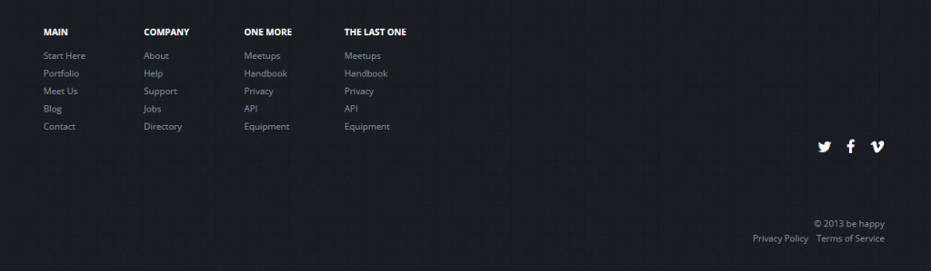
PSD to HTML Conversion Part 3 (the Footer)
The footer is a section at the bottom of a website. It serves as an area to provide information and navigation options that are essential but not the primary focus of the website. Typically, a footer includes the following components:
Navigation Links
Contact Information
Social Media Icons
Legal Information
Company Information
Let’s create our footer now. First, set the nav tag with a class of .footer-nav for the navigation and add columns with .column. Then to each of them add a title as a heading level h4 with the class .title and a list of links.
PSD to HTML Conversion: Part 4 (the Center Blocks)
Finally, it’s time to create the three big blocks in the middle of the page. This task may seem straightforward, but it actually entails quite a bit of work. That includes these and some other tasks:
Placing images
Creating borders
Measuring the blocks
Adding additional styling
Setting transparency
If you look closely at the blocks, you will see that they are one and the same block but with different content. Therefore you need to create one block, style it, multiply it, and fill it in with the necessary content.
I will save the photos in these blocks as .jpg images. The border and triple border at the bottom will be created with CSS.
If the photos do not have transparency, they should always be saved in the .jpg format so that they do not create extra bloat and retain their maximum quality. As a rule, a compression ratio of 60% is enough. You will only need 70 to 80% if there is text in a photo and you want to save it as an image.
The top big images will be named photo1, photo2, etc.
Now let’s write HTML and paste the saved images into it. Create div.blocks and place three inner blocks (each called div.block) into it. You can see an example block below:
Measure the width of the blocks and margins between them. Their width is 351px and the right margin is 43px. Since there is only one row of blocks, it would be best to set the left margin and cancel it for the first one using the selector :first-child:
Now, add margin: 80px 0 75px; to div.blocks. Add a border to the div.block and set a margin. You can take the margin size and border color from the Photoshop file. Since the blocks have rounded corners, define the required border-radius. Also set the property vertical-align: top; to remove the unnecessary bottom margin from the images.
To add additional styling to the bottom blocks, use the pseudo-selectors ::after and ::before. You can apply them to .blocks and position at the bottom. To do this add the following code:
Now let’s code a news block. It consists of three pieces of news. Each of them has a round image, title and date. Like in the blocks above we will code one block and duplicate it.
Crop some square images from the PSD file and make them round with the CSS property border-radius: 50%;. The date will be created with the tag <time>, the title with <h4>, and the paragraph with <p>.
To cut a rectangular image, which is made round via mask in the design, you need to do the following: select the “Move Tool (V)“, then the checkbox “Auto-Select” and “Layer” in the selection.
Then click on a round image to select it in the layers.
Carefully select the required area of the image. The image should be the same size as the area you select.
Press the combination of Ctrl + C and then Ctrl + N to create a new document, Ctrl + V to insert the image there, and Alt + Shift + Ctrl + S to save the image for the Web as a .jpg. I prefer naming images in the same way I do the blocks so I’ll name it news1.jpg. Repeat the same thing for the two other images.
Write the code for one of the blocks. Call the parent block section.news, and each news item article.one. Add a 2px border to the main block, set the margins at the bottom and add flexbox.
HTML:
<section class="news">
    <article class="one">
      <div class="img"><a href="#"><img src="images/news1.jpg" height="89" width="89" alt=""></a></div>
      <div class="text">
          <time datetime="2022-10-18">Oct 18</time>
          <p><a href="#">I would like to avoid making these mistakes.</a></p>
      </div>
    </article>
    <article class="one">
      <div class="img"><a href="#"><img src="images/news2.jpg" height="89" width="89" alt=""></a></div>
      <div class="text">
          <time datetime="2022-10-08">Oct 8</time>
          <p><a href="#">But how do you avoid mistakes you make by default?</a></p>
      </div>
    </article>
    <article class="one">
      <div class="img"><a href="#"><img src="images/news3.jpg" height="89" width="89" alt=""></a></div>
      <div class="text">
          <time datetime="2022-10-28">Oct 2</time>
          <p><a href="#">Ideally you transform your life so it has other defaults.</a></p>
      </div>
    </article>
</section>
It’s the news section so you can add links to the images too.
The next part to complete is the “Featured on:” section. Use <ul> for the list of images and the usual <h5> with the class .title for a mini header. According to the design, the logos have hover states and their initial state has a 50% transparency. However, when saving images, you need to specify 100% transparency, i.e. disable it.
In the markup, you will implement this with the opacity property. You should save logos, icons and other non-photo elements in a .png format to ensure these images will remain high quality.
That’s it! Refresh the browser window to verify that the page looks exactly the way it does in the design. Now let’s bring it to life and make it a little better by adding underlines as hover states for the links and subtle effects on the image and menu links.
a {
    text-decoration: none;
    transition: all 0.3s;
}

a:hover {
    text-decoration: underline;
}
Remove the underlines from the navigation hover state and buttons in the .hero block. Add a slight transparency to the button hover states.
We can also slightly optimize our CSS. All of our lists have the same 3 lines of code. Instead of repeating it, let’s write it once to simplify things. In order to do that, we will list the selectors separated by commas like so:
Now let’s remove these lines in each CSS code block so that things will look cleaner and slightly minimized in size.
Hurrah, the page is ready! Now you know how to convert PSD to HTML!
I hope this tutorial was helpful. Please feel free to download the template code.
PSD to HTML conversion FAQs
Is PSD to HTML still relevant in 2026, or is Figma to HTML usually the better handoff?
PSD to HTML is still common, but Figma to HTML is a more popular approach nowadays. PSD to HTML conversion is used in legacy projects, enterprise design systems, and existing agency pipelines that are still based on Photoshop.
The choice largely depends on the needs of the team and the design ecosystem. Figma offers more flexibility with real-time collaboration and convenient inspection tools. PSD may be a preferred choice for advanced raster editing or working with older assets. Therefore, teams should generally use Figma for new projects and stick to PSD to HTML to support existing workflows.
When does manual PSD to HTML conversion from GetDevDone make more sense than using an automatic converter?
Based on our experience, manual conversion is better when accuracy, scalability, and code quality matter. Automatic converters are faster but often fail to process complex layouts, production-level quality, or responsive behavior. As a result, automated conversion output requires additional cleanup and may take more time in the end.
Overall, manual PSD to HTML conversion is better than automatic for:
Complex designs with multi-layered layouts and custom elements
Conversions that require high code quality and reusable components
Responsive designs and cross-browser compatibility
Custom interactions or animations
What usually increases PSD to HTML cost the most: design complexity, responsiveness, or the number of unique elements?
Design complexity typically has the most impact on the cost of PSD to HTML conversion. When the design has sophisticated layouts, custom typography, layered effects, and animations, converting them properly takes more time and manual effort.
Responsiveness also affects the cost, but it is partially related to complexity, because complex designs are usually more demanding in terms of responsiveness. Uniqueness is another significant pricing factor, particularly for designs that are not reusable.
That is why, if you are concerned about expenses, GetDevDone recommends limiting highly custom designs and focusing on reusability. It is important to find the balance between design quality and development efficiency.
What hidden problems appear when PSD to HTML is done with automatic conversion tools versus GetDevDone’s approach?
When conversion happens with automatic tools, code quality may suffer. Automatic converters generate code with hidden vulnerabilities, making it prone to breaking and inflexible. Other common issues with automatic conversions are poor SEO performance and increased security risks.
Automation offers convenience and speed, but creates technical debt. That is why GetDevDone prefers manual conversions and checks that ensure easily modifiable, clean code. Our developers thoroughly test pages to eliminate flaws and apply best security practices.
Can a PSD to HTML build from GetDevDone be reused later inside WordPress or another CMS?
Yes. Engineering teams can reuse PSD to HTML builds inside WordPress or another CMS with some adaptation. The delivered HTML follows standards and provides a front-end foundation that can be converted into themes or templates.
When reusing a build with a CMS, it still needs to be adapted to the target templating system. The better the quality of HTML, the easier future CMS integration will be.
What should an agency prepare before sending a PSD file to a markup partner?
Before sending a PSD for conversion, an agency should ensure the design is well-organized and documented. Clear inputs reduce delays and misinterpretation during development.
Preparation checklist:
Organize layers with clear naming and grouping
Remove unnecessary or hidden layers
Document fonts, colors, and spacing
Provide responsive behavior guidelines
Export assets or mark them for export in proper formats
What quality checks does GetDevDone perform before approving a PSD to HTML delivery?
GetDevDone applies multiple QA approaches, including cross-browser testing, rendering verification, and functionality testing. The QA phase involves project managers, QA engineers, and developers to ensure production-ready code.
Main checks include:
Cross-browser and cross-device testing
Pixel-perfect comparison with the original PSD
Markup validation and HTML/CSS structure review
Functionality and responsiveness testing
How long does PSD to HTML from GetDevDone usually take for a simple landing page versus a more complex multi-section build?
Converting a simple landing page usually takes 1–2 business days, depending on requirements and level of detail. A more complex multi-section build can take from several days to weeks based on architecture, responsiveness, and unique elements.
Accurate timelines require evaluating the PSD file and project scope. More complex designs take longer due to increased manual work and testing.