

- Best practices, WordPress development
- 7 min read
WordPress Front-End Development: Best Practices and Common Mistakes
WordPress front-end development best practices: improve performance, maintainability, Gutenberg compatibility, and code quality.
Discover essential lawyer website design principles to build trust, improve UX, and attract more legal clients online.
TL;DR
Lawyer website design should focus on trust, easy navigation, and multiple contact options because these factors have a direct impact on whether potential clients engage with a law firm online.
These days, no one argues the importance of online presence for every type of business. Whether it’s a real estate agency or a financial or insurance company, most consumers begin searching for professional services on the Internet before dialing a phone number or driving to the office.
Legal businesses are no exception. A website is extremely important for every law firm, large or small. It serves as the first point of contact for your prospective clients and can become a powerful marketing medium to put your business in the spotlight.
A website is particularly valuable for small-time attorneys, who don’t have lavish resources to put up a decent fight with legal behemoths. It allows them to draw more organic traffic without having to splash out money on paid advertising.
Once you realize how vital it is to build a website for a lawyer, there are two common ways to approach this task.
Know something about web development? Then, leverage the power of a content management system (CMS) such as WordPress or a page builder such as Squarespace. They considerably facilitate the process of building a lawyer website for those who have never done it before.
With WordPress, you can use tons of free and commercial themes crafted specifically for law firms. Here are some examples. Just pick one and tweak it to match your brand. You can also add appropriate plugins to make your website more functional. For instance, you can integrate Google Analytics to learn about your visitors’ on-site behavior and preferences.
Using a CMS or page builder to create a lawyer website with no help from outside is a convenient and cheap method. That being said, it does have some serious drawbacks:
The alternative method is to entrust the entire building process to expert WordPress developers.
Depending on your business needs and plans, building a lawyer website by professionals from the ground up can be more or less expensive. It certainly costs more than the previous approach does. The benefits it brings you in the end, though, are well worth your money and time.
Since 2005, GetDevDone has helped agencies and brands develop custom websites, including websites for law firms. Our team combines web design, WordPress development, and technical ownership to deliver websites tailored to business requirements.
No matter the method you ultimately choose to build a website for your law firm, there are certain design considerations you can’t ignore. Let’s take a look at these next.
Have you ever been in a large building with lots of offices and corridors? Suppose you’re looking for the office of a specific law firm without knowing its exact location inside the building. There’s no directory on the ground floor to tell you how you can find the office, so you have to walk from floor to floor scanning doorplates.
Doesn’t seem a convenient method to find what you need, right? The same goes for a lawyer website. If your navigation is confusing and hard-to-follow, this will annoy your visitors, and they will leave your site once and for all.
There are several important rules to follow as far as website navigation is concerned:
Easy-to-navigate lawyer websites are not only great from a UX perspective. The likes of Bing also rank them high. This is because robots can index the content on such sites effortlessly.
If you find it hard to come up with the optimal layout and navigation when building your lawyer website, our expert UX designers are always ready to assist you with this task.
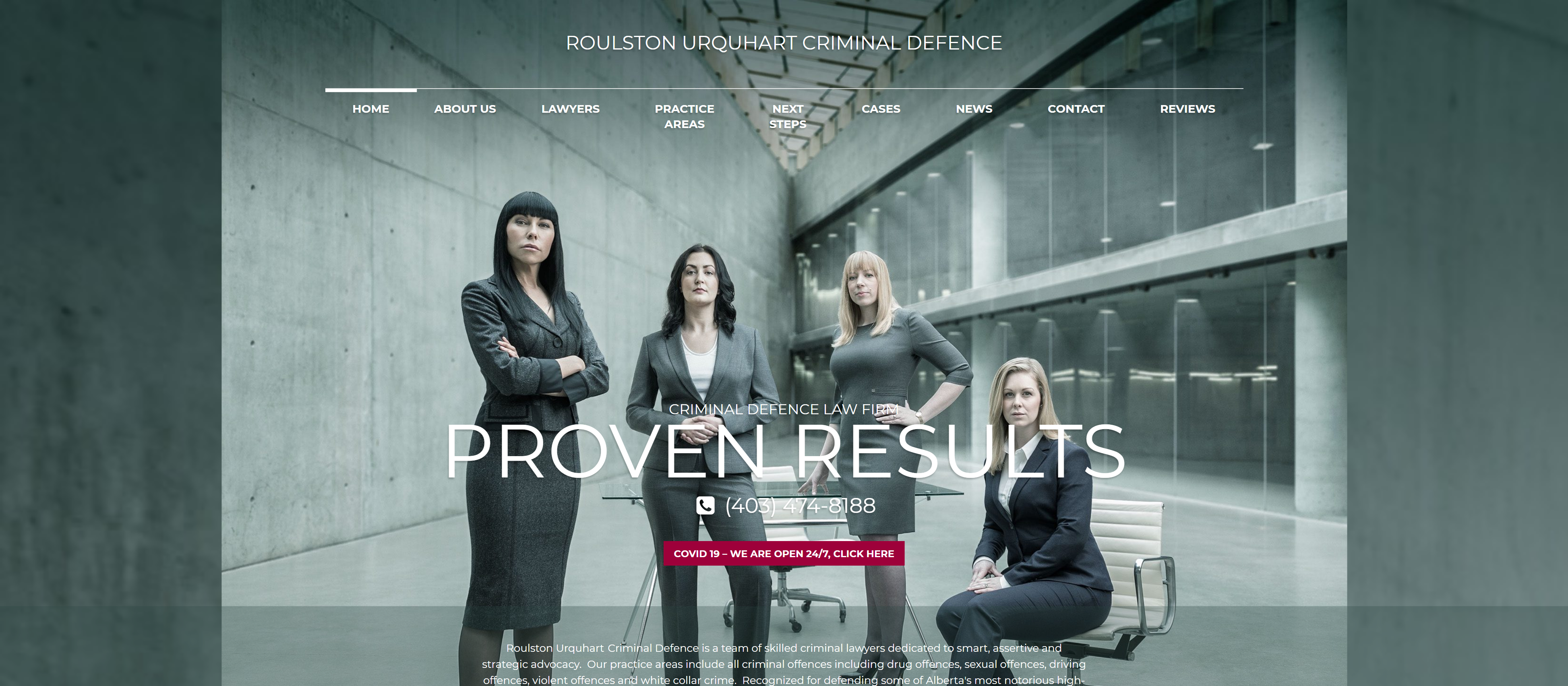
Your law firm website can have the best navigation, layout, and content in the world, but if you neglect the visual representation of your law firm, don’t expect much value from your online resource.
The main goal of building your lawyer website is to convince your prospective clients that they can trust you implicitly. You can write thousands of words trying to prove that, but they won’t be even remotely as effective as one perfectly shot photo of your team or an engaging video where you talk about your successfully resolved cases.
A law firm website can’t do without great visuals. Here’s what you need to know regarding this aspect of lawyer website development:
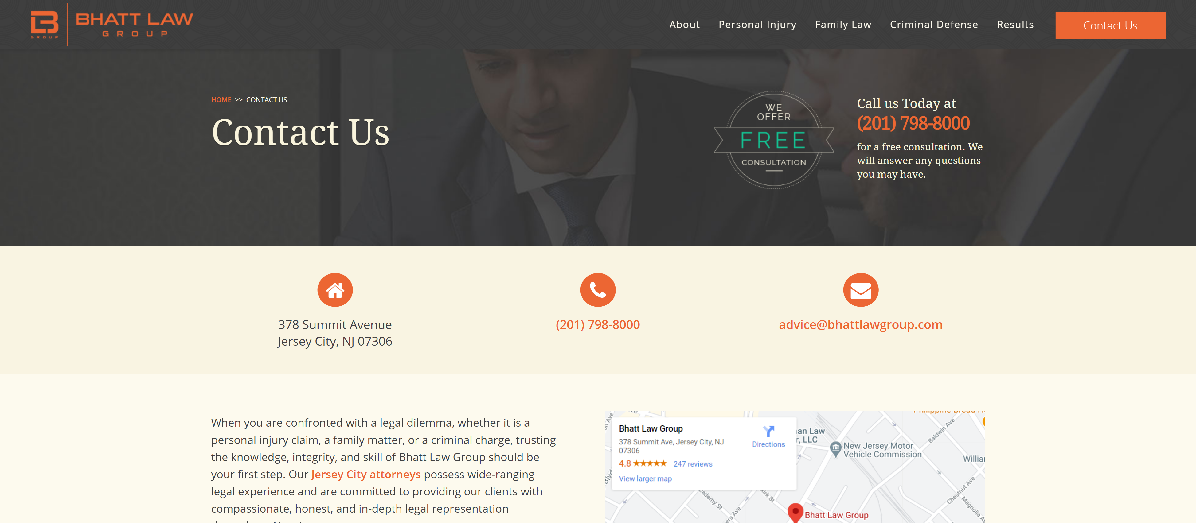
After adding great-looking images, implementing a smooth navigation system, and writing engaging content for your website, you can expect that your prospective clients will want to establish a connection with you.
One important design principle to follow when building a website for a lawyer is to provide as many points of contact for your visitors as possible. Here are the key ones:
Building a lawyer website is a wise move. It allows legal businesses to attract more clients and leads with less effort. The success or failure of a law firm website hinges upon many factors. Its proper design is one of the most crucial.
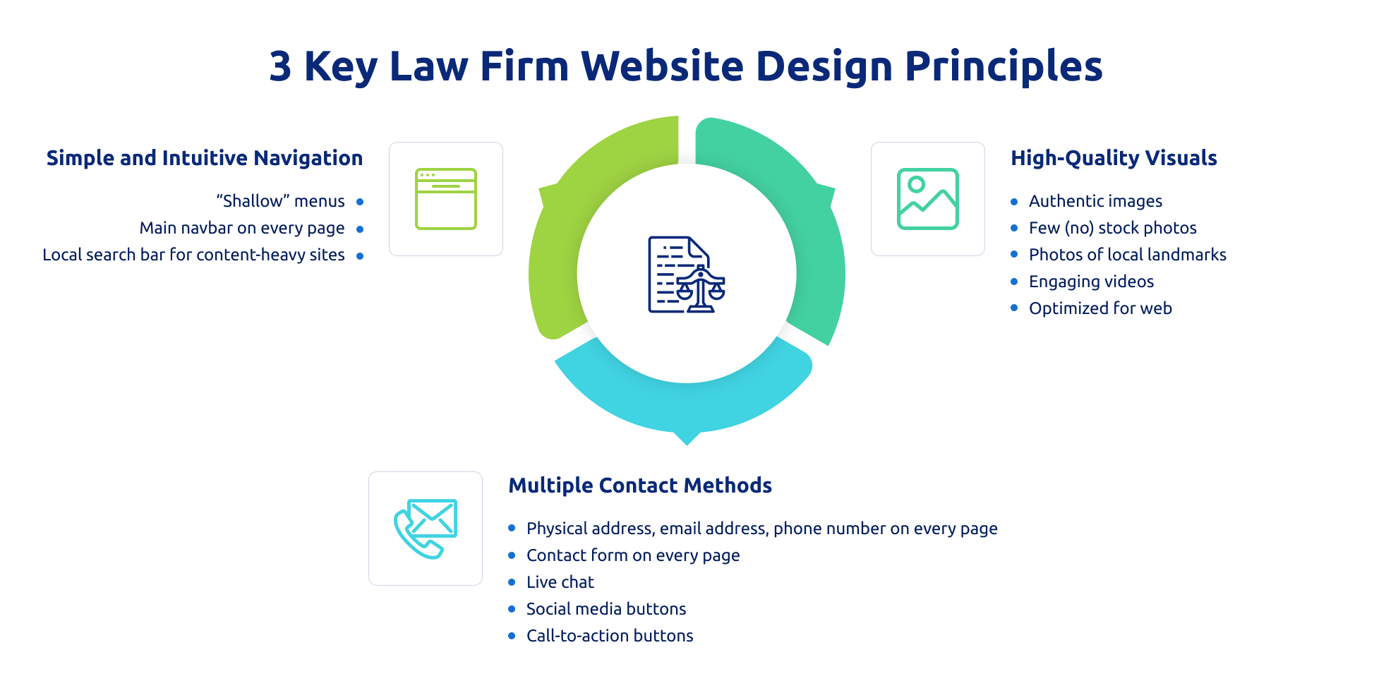
The 3 design principles we’ve discussed in this post are only some of many. We’ve just scratched the surface. Nothing can be ignored as far as a lawyer website goes.
However, first of all, you should make a favorable impression on your visitors with high-quality visuals, let them move around your website quickly, and enable them to get in touch with you in multiple ways. Then, fill the pages with engaging and informative content.
While you can use page builders to put together a simple website, turning to professional web developers for assistance will bring you more value at the end of the day. You will get a unique-looking website with excellent performance and desired functionality.
GetDevDone helps law firms build, improve, and scale WordPress websites through custom development, web design, and ongoing technical support, backed by over 20 years of website development experience.

Website development built for stronger UX, clearer navigation, and better lead conversion.
Order nowA page builder is usually enough for a small, simple lawyer website, but a professional design and development team is the safer choice when the site needs to look distinct, support custom features, or stay easy to maintain after launch.
The practical difference is not only the first build cost. Page builders can reduce the initial budget, but they often rely on similar templates, plugin combinations, and design blocks. That can be acceptable for a solo attorney who needs a basic online presence. It becomes weaker when the firm needs a stronger brand impression, multiple practice-area pages, attorney profiles, case pages, custom intake flows, analytics, SEO setup, or better performance control.
For agencies delivering legal websites for clients, the risk is usually handoff. A template site may look fine in a demo, but problems appear when the client asks for new page types, cleaner editing, form routing, tracking, or performance fixes. In that situation, working with a WordPress development partner can reduce rework because structure, QA, and maintainability are planned before launch.
A page-builder lawyer website is good enough when the firm needs a small brochure site with a few stable pages, simple contact options, and no unusual functionality.
It becomes limiting when the website has to support heavier content, more complex navigation, or business-specific workflows. For example, a page builder may work for a five-page site with Home, Practice Areas, About, Attorney Profile, and Contact. It is less convincing for a growing firm with many practice areas, multiple attorneys, location pages, case summaries, live chat, intake forms, CRM routing, call tracking, or a strict content approval process.
The hidden cost is not always visible at the start. The site may be cheap to launch but expensive to adjust later if every new layout depends on manual edits, fragile plugins, or workarounds. For legal websites, that matters because credibility, clarity, speed, and easy contact paths are not decorative extras. They are part of the conversion path.
The easiest pages to find should be the pages that help a visitor answer three questions: what legal help do you provide, who will handle my issue, and how can I contact you?
For most law firm websites, that means the main navigation should make these pages obvious:
A visitor should not have to understand the firm’s internal structure to find help. Someone looking for a divorce lawyer, immigration lawyer, personal injury lawyer, or business attorney will usually scan for their legal problem first, then check the people behind the firm, then decide whether to contact them. The navigation should follow that decision path.
Lawyer website navigation should stay shallow enough that key pages are reachable in one or two clicks from almost anywhere on the site.
The main menu should not try to hold every detail. It should point to the pages that matter most: practice areas, attorney profiles, cases or results where relevant, and contact options. Deeper supporting pages can live under those sections, but they should not be buried behind several layers of dropdowns.
Large firms may need more structure because they have many attorneys, offices, services, or industries. Even then, shallow navigation is still the goal. Use grouped practice areas, clear labels, breadcrumbs, and, if needed, site search. A complicated menu can make a serious firm look harder to work with than it actually is.
The most trustworthy visuals are specific to the firm: real attorneys, real office settings, local context, and restrained video content that helps visitors understand who they may be contacting.
Good visual choices include professional attorney portraits, team photos, office images, local city or neighborhood photography, and short videos explaining the firm’s approach or common client questions. These assets support credibility because they reduce uncertainty. A visitor can see the people, the setting, and the tone of the practice before making contact.
Avoid overused legal symbols as the main visual language. Gavels, scales, columns, and dramatic courtroom shots can make the site feel generic. They may still work in small doses, but they should not replace the firm’s own identity.
Contact forms and CTA buttons should appear where the visitor is likely to make a decision, not only on a separate Contact page.
For many law firm websites, this means a clear consultation CTA in the header or hero area, contact details on attorney and practice-area pages, and a short form near the upper part of important landing pages. A second CTA can appear after a useful section, such as after practice-area details, attorney credentials, FAQs, or case examples.
The form should stay short. Name, email, phone, and a brief message are usually enough for the first step. Longer forms can create friction, especially for stressed visitors who need legal help quickly.
For agency delivery, CTA placement should be decided before development starts. If forms, chat, phone tracking, CRM routing, or email notifications are added late, the launch QA becomes more fragile.
Before handoff, an agency should check whether the website works as a real lead path, not just whether the pages look finished.
A practical handoff check should cover:
For legal clients, the agency should also separate technical QA from legal review. Developers can test forms, routing, performance, and content display. The law firm should approve legal claims, disclaimers, privacy wording, case-result language, and any jurisdiction-specific advertising requirements.
WordPress front-end development best practices: improve performance, maintainability, Gutenberg compatibility, and code quality.

Discover how customer-centric design can supercharge your website's impact and keep visitors coming back for more!

10 vibe coding security audit checklists for agencies covering AI-generated code risks, auth, secrets, APIs, uploads, dependencies, deployment, and handoff.