WCAG 2.2 expands web accessibility requirements with 9 new success criteria that improve keyboard navigation, pointer interactions, authentication, and usability for people with visual, cognitive, learning, and motor disabilities.
Review the nine new WCAG 2.2 success criteria because they introduce additional accessibility requirements beyond WCAG 2.1
Ensure keyboard-focused elements remain visible, focus indicators are clear, and repeated help mechanisms stay consistent across pages
Provide alternatives to dragging interactions, use adequately sized touch targets, and avoid requiring users to re-enter information during the same process
Implement accessible authentication methods that do not depend solely on memory, puzzles, or other cognitive function tests
Evaluate accessibility during both design and development because meeting WCAG 2.2 requires updates to interface design, interactions, and front-end implementation
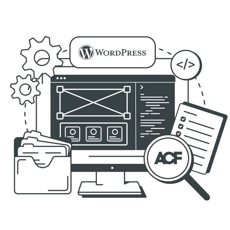
Web accessibility today is about ensuring equal access to information and opportunities for all. For businesses, web accessibility brings tangible benefits, like more customers with a better user experience, broader audience reach, improved business reputation, and boosted search engine optimization.
As a web development company committed to making the web inclusive, we keep a close eye on updates to web accessibility guidelines. Our top priority is ensuring that everyone, regardless of their abilities, can easily access and interact with the websites we develop.
In this post, we review nine additional Success Criteria (SC) introduced in the new Web Content Accessibility Guidelines (WCAG) – WCAG 2.2 – aimed at improving accessibility for individuals with visual impairments, cognitive and learning disabilities, and motor limitations.
The 9 New Success Criteria Introduced in WCAG 2.2: An Overview
#1: Success Criterion 2.4.11 Focus Not Obscured (Minimum) – Level AA
When a user interface component receives keyboard focus, the component is not entirely hidden due to author-created content.
The Reasoning Behind This SC Introduction
Let’s break down this Success Criterion. It’s all about making sure that when you’re using your keyboard to navigate a webpage, the element you’re focusing on is at least partly visible. This is really important for people who rely on a keyboard or similar device, as it helps them see where they are on the page.
Now, in today’s world of intricate web designs, it’s understood that sometimes the element you’re focusing on might be slightly hidden by other elements. But the more hidden it is, the harder it gets to see. So, web designers and developers should try to reduce how often and how much this happens. Ideally, the focused element should always be fully visible.
Elements like sticky footers, headers, and non-modal dialogs can overlap with the focused element, making it harder to see. For example, a sticky notification like a cookie banner would fail the Success Criterion if itcompletely hides a focused element.
To fix this, the banner could be made modal, meaning it has to be dismissed before you can navigate the page, or scroll padding could be used to stop it from overlapping.
accessibility
Our Approach
When we come across a popup, modal window, or burger menu that obscures the opening element, we employ JavaScript to move the cursor to the first focusable element in that block. It helps the user understand where they’re right now by visually highlighting the state of the focused item. We also use a screen reader that reads highlighted text out loud.
When a user interface component receives keyboard focus, no part of the component is hidden by author-created content.
The Reasoning Behind This SC Introduction
The primary objective of this Success Criterion is to ensure the item that’s receiving keyboard focus remains visible at all times. Just like the previous SC, this one is integral for users who rely on a keyboard or similar input devices, providing them with a clear understanding of their current location on a webpage.
Examples of how this criterion can be met include the use of the same methods as in the previous SC: scroll padding to keep the focused item visible, modal dialogs that don’t obscure the focused item, and notifications that disappear when they lose focus without hiding other controls. This ensures a more accessible and user-friendly experience for all.
When the keyboard focus indicator is visible, an area of the focus indicator meets all the following:rnrnis at least as large as the area of a 2 CSS pixel thick perimeter of the unfocused component or sub-component, and rnhas a contrast ratio of at least 3:1 between the same pixels in the focused and unfocused states.
The Reasoning Behind This SC Introduction
This Success Criterion has one key purpose: to ensure that when you’re using a keyboard to navigate, the focus indicator is always clear and noticeable. This is closely tied to the 2.4.7 Focus Visible and 1.4.11 Non-text Contrast rules.
While Focus Visible makes sure there’s a visible sign when an item gets keyboard focus, Focus Appearance sets a minimum level for how visible that sign should be. Similarly, Non-text Contrast ensures that a component stands out from the background, and Focus Appearance requires the focus indicatoritself to have enough contrast.
Again, this is really important for anyone using a keyboard or similar device, like a switch or voice input. It’s essential to know where you are on the page. And it’s also crucial for people with low vision who might be relying on the keyboard to navigate.
The focus indicator can take different forms. Though a solid outline around the focused item is encouraged, other types of equally noticeable indicators are also acceptable.
#4: Success Criterion 2.5.7 Dragging Movements – Level AA
All functionality that uses a dragging movement for operation can be achieved by a single pointer without dragging, unless dragging is essential or the functionality is determined by the user agent and not modified by the author.
The Reasoning Behind This SC Introduction
This SC is about making sure that if something on a website involves dragging movement, there’s another way to do it with just one click. This is important because not everyone can make precise dragging movements. Some people use devices like trackballs or eye-gaze systems, which can make dragging difficult and prone to errors.
When an interface uses dragging, it usually involves four steps:
Clicking to set a starting point.
Holding that click while…
…moving the pointer to a new location, then…
…releasing the click at the endpoint.
However, not everyone can accurately do the “press-and-hold while moving” part. That’s why we need to provide an alternative for users who have mobility issues but use a pointer, like a mouse, pen, or touch input.
This is separate from making things accessible for keyboard use. Why? Because those using a touchscreen may not use a physical keyboard. They can’t use typical keyboard actions like tabbing or arrow keys when faced with a drag-and-drop control.
However, having a text input could be a good single-pointer alternative to dragging. For instance, if there’s a slider, having an input box next to it could allow users to enter an exact value. The on-screen keyboard that appears for touchscreen users provides a way to enter alphanumeric values with just one pointer.
Lastly, this criterion doesn’t apply to user-agent-enabled scrolling. It doesn’t cover scrolling a page or using techniques like CSS overflow to make a section of content scrollable.
accessibility
Our Approach
Regarding this specific Success Criterion, our primary focus revolves around carousels, for which we leverage Swiper.js to achieve the necessary functionality.
If the features provided by this JavaScript library fall short of meeting the SC for drag-and-drop movement, we resort to implementing a custom coding solution.
#5: Success Criterion 2.5.8 Target Size (Minimum) – Level AA
The size of the target for pointer inputs is at least 24 by 24 CSS pixels, except where:rnrnSpacing: Undersized targets (those less than 24 by 24 CSS pixels) are positioned so that if a 24 CSS pixel diameter circle is centered on the bounding box of each, the circles do not intersect another target or the circle for another undersized target;rnEquivalent: The function can be achieved through a different control on the same page that meets this criterion;rnInline: The target is in a sentence or its size is otherwise constrained by the line-height of non-target text;rnUser agent control: The size of the target is determined by the user agent and is not modified by the author;rnEssential: A particular presentation of the target is essential or is legally required for the information being conveyed.
The Reasoning Behind This SC Introduction
So, the whole idea behind this Success Criterion is to make sure that when you’re trying to click or tap on something, you don’t accidentally activate something else that’s too close. This can be a real pain for people who have a tough time with precise movements.
Hitting a small target gets even trickier when there’s another one nearby. By making these targets big enough, or at least putting enough space between them, we can help avoid those accidental clicks or taps.
This rule really helps those dealing with hand tremors, spasticity, quadriplegia, or other conditions that affect their dexterity. Some of these people might use special input devices that aren’t as pinpoint accurate as your typical mouse or trackpad. The bright side is that by meeting this requirement, we’re also making touchscreen interfaces easier to navigate.
Just to clear things up, this Success Criterion sets a minimum size for targets and, if that’s not possible, a minimum amount of space between targets. So, technically, you could still have tiny, hard-to-hit targets and meet this requirement, as long as they’re not too close to any other targets.
But let’s be real, bigger targets are going to be easier for a lot of people to use. So, the best practice is to at leasthit the minimum size requirement of the Success Criterion, no matter how much space you’ve got around your targets.
accessibility
Our Approach
In this context, the design plays a crucial role. If the element is very small, it should either be isolated from neighboring elements or positioned a bit farther away to allow for comfortable interaction. We frequently encounter this situation in mobile menus, especially when dealing with a small arrow as the nested menu opener. In such cases, we ensure that the button is appropriately sized to enable easy tapping for users.
#6: Success Criterion 3.2.6 Consistent Help – Level A
If a Web page contains any of the following help mechanisms, and those mechanisms are repeated on multiple Web pages within a set of Web pages, they occur in the same order relative to other page content, unless a change is initiated by the user:rnrnHuman contact details;rnHuman contact mechanism;rnSelf-help option;rnA fully automated contact mechanism.
The Reasoning Behind This SC Introduction
Basically, the idea behind this SC is to make sure people can find help when they need it on a website. It’s all about consistency – if you put your help features in the same spot across different pages, users will have an easier time finding them. This isn’t about those little extras like spell checkers or form instructions, but more about the big-picture help.
Making sure your help feature is in the same place on each page makes it a lot simpler for users to find. So, if you’ve got a link or some kind of help buttonin the header of one page, it’s best to keep it in the header on other pages too.
It could be something like a contact phone number right there on the page, or even a link that takes you straight to a contact page. But whatever it is, it needs to be in the same spot on each page.
When checking to see if this SC is met, you need to see where the help feature is in relation to the rest of the content on the page. If other content that’s on every page comes before the help feature, then it should be the same on this page. And anything that comes after the help feature on other pages should come after it on this page, too.
create
Note
If the help feature is visually in a different spot, but in the same order, it might not be as helpful from a user’s perspective, but it wouldn’t technically fail this criterion.
When someone’s having trouble doing something on a website (or part of a website, which we call a set of web pages), some people with certain types of disabilities might not be able to figure it out without some extra help. They might be struggling with filling out a form, finding a document, or locating a page with the info they need to finish a task.
Without help, some users might just give up. They could also mess up a task, or end up needing help from someone who might not keep their private info safe.
accessibility
Our Approach
This issue should ideally be addressed while planning the website’s structure. When we encounter inconsistencies in how user assistance is provided, we bring this to the client’s attention and recommend that they should reconsider the website’s structure, especially if accessibility is crucial for them.
#7: Success Criterion 3.3.7 Redundant Entry – Level A
Information previously entered by or provided to the user that is required to be entered again in the same process is either: rnrnauto-populated,rnor available for the user to select.rnrnExcept when:rnrnre-entering the information is essential,rnthe information is required to ensure the security of the content, or rnpreviously entered information is no longer valid.
The Reasoning Behind This SC Introduction
This SC is designed to simplify user experiences, particularly for multi-step processes. It’s about not asking you to input the same information twice within a single process.
Remembering information can be a challenge, especially for users with cognitive or memory issues. It’s also tiresome for everyone else, as the effort to recall information can accelerate fatigue and lead to errors.
While the browser’s autocomplete feature offers some help, it doesn’t fully address the problem. It’s up to the website to provide you with the information you’ve already entered during a process.
This criterion doesn’t imply that websites should store your data between sessions. It only applies within a single activity. However, if a process involves different domains, such as a transaction with a third-party payment provider, it’s included in this criterion.
“Available for the user to select” includes various methods of populating fields, whether it’s choosing an option from a dropdown, copying text into an input field, or using a checkbox to reuse information.
The data that’s “available for the user to select” should ideally bevisible on the same page and closely associated with the input field. But it might also be elsewhere on the page, perhaps hidden behind a show/hide component.
This criterion doesn’t apply if you’re providing data in a different way, like uploading a document. It also doesn’t affect how passwords are auto-filled by your browser.
While this criterion doesn’t specifically discuss privacy, it’s important to ensure data protection when implementing features like auto-population. There’s a need to avoid exposing personal info while preventing redundant entry.
Finally, there are exceptions to this rule. For example, if re-entering info is essential for security measures, or if the previously entered information isno longer valid.
#8: Success Criterion 3.3.8 Accessible Authentication (Minimum) – Level AA
A cognitive function test (such as remembering a password or solving a puzzle) is not required for any step in an authentication process unless that step provides at least one of the following:rnrnAlternativernAnother authentication method that does not rely on a cognitive function test.rnrnMechanismrnA mechanism is available to assist the user in completing the cognitive function test.rnrnObject RecognitionrnThe cognitive function test is to recognize objects.rnrnPersonal ContentrnThe cognitive function test is to identify non-text content the user provided to the Web site.
The Reasoning Behind This SC Introduction
This rule is all about making sure there’s a simple, safe way to sign in. Most websites use usernames and passwords, but remembering or writing down all that info can be really tough, especially for people with certain cognitive disabilities.
While some sites use things like recognizing objects or user-provided non-text content to help with this, it’s not the best solution for everyone.
So, instead of using a regular Captcha on your website, сonsider some alternative methods. One of the safest approaches is to use the reCAPTCHA from Google. It can be hidden, and in most cases, the user doesn’t even notice that it’s there.
As for other types of Captchas, make sure that they meet the accessibility requirements before incorporating them into your website.
A cognitive function test (such as remembering a password or solving a puzzle) is not required for any step in an authentication process unless that step provides at least one of the following:rnrnAlternativernAnother authentication method that does not rely on a cognitive function test.rnrnMechanismrnA mechanism is available to assist the user in completing the cognitive function test.
The Reasoning Behind This SC Introduction
Let’s break it down. The idea here is to make sure everyone can easily and safely log in, access stuff, and get things done. It’s a lot like Accessible Authentication (the previous SC), but without any exceptions for objects or user-provided content.
When you’re going through the login process:
You won’t be shown a bunch of images, videos, or audio clips and asked to pick the one you provided;
You won’t be shown a bunch of images and asked to pick out the ones with a specific object, like a car.
What’s the payoff? Even if a user has problems with memory, reading (like dyslexia), numbers (like dyscalculia), or perception-processing limitations, they’ll still be able to log in. Their cognitive abilities won’t be a barrier.
Here are some examples of websites that meet this SC:
A website uses properly labeled username (or email) and password fields for login. Your browser or a third-party password manager extension can figure out what the fields are for and automatically fill in your username and password.
A website lets you paste text. You can use a third-party password manager to store your login details, copy them, and paste them right into the login form.
A website uses WebAuthn so you can use your device instead of a username/password to log in. Your device could use any method it has available. On laptops and phones, common methods are facial-scan, fingerprint, and PIN (Personal Identification Number). The website doesn’t enforce any particular method—it assumes you’ll set up something that works for you.
A website lets you log in with a third-party provider using the OAuth method.
A website that needs two-factor authentication gives you multiple options for the 2nd factor, including a USB-based method where you just press a button to enter a time-based token.
A website that needs two-factor authentication shows a QR code that you can scan with an app on your device to confirm who you are.
A website that needs two-factor authentication sends a notification to your device. You have to use your device’s authentication method (like a user-defined PIN, fingerprint, or facial recognition) to confirm who you are.
That concludes our review. WCAG 2.2 is an important milestone in the evolution of web accessibility standards. It goes beyond the mere compliance checklist; it aims at creating a more inclusive web where everyone has equal access and opportunities.
As technology continues to evolve, it’s paramount that accessibility remains at the forefront of web design and development, ensuring that no one is left behind in the digital world.
GetDevDone Champions Full Compliance With WCAG 2.2 Success Criteria
Right after WCAG 2.2 was released, our developers dove headfirst into understanding its intricacies, focusing on the new success criteria we’ve discussed in this post. And you know what? They discovered that we’ve been incorporating these requirements into our clients’ web solutions for quite some time.
From ensuring visible focus on elements and consistent help to providing varied authentication methods, we’re committed to accommodating users of all abilities.
Is your front-end ready for accessibility requirements?
WCAG-focused implementation with performance and quality built-in.
The WCAG 2.2 criteria most likely to create real update work are the ones tied to common interface components: focus visibility, touch target size, dragging alternatives, repeated form entry, and authentication.
In practice, the first problems often appear around sticky headers and cookie banners that hide keyboard focus, mobile menu arrows that are too small to tap, carousels that depend on dragging, multi-step forms that ask users to re-enter the same data, and login flows that rely on memory tests, puzzles, or hard-to-use CAPTCHA patterns.
The AAA criteria may not be required for every project, but they can still expose design system weaknesses. If focus states are barely visible, inconsistent, or easily hidden by overlays, the site may pass a narrower requirement and still be frustrating to use.
No, all nine WCAG 2.2 success criteria do not apply equally to every website. Their relevance depends on the site’s features, target conformance level, and user flows.
For example, Dragging Movements matters when a site uses drag-and-drop controls, sliders, maps, sortable lists, or carousels. Accessible Authentication matters when users need to log in. Redundant Entry matters in multi-step processes where users are asked to provide the same information again. Consistent Help matters when help mechanisms repeat across multiple pages.
Focus and target-size criteria tend to be broader because most websites have buttons, links, menus, forms, banners, and overlays. Still, the right approach is not to assume every page has every issue. Review the actual components and flows, then map each issue to the relevant criterion.
Level A is the minimum conformance level, Level AA includes Level A plus additional requirements, and Level AAA includes A, AA, and AAA criteria.
In practical website work, Level AA is often the main target because it gives teams a stronger accessibility baseline without requiring every enhanced AAA criterion. That said, the correct target should come from the client’s legal obligations, procurement requirements, industry rules, or internal policy. It should not be guessed during development.
AAA criteria are not useless, but they need judgment. Some are good design and QA goals, especially around focus clarity. Others may be difficult to apply across a full site. Treat AAA as a deliberate scope decision, not as something silently added at the end of a project.
Updating a website for WCAG 2.2 is both a design and development task. Design affects target sizes, spacing, visible focus states, help placement, and how interactions are presented. Development affects keyboard behavior, focus management, form logic, authentication, component states, and whether the design actually works with assistive technologies.
The risky part is the handoff gap. A design may show a clean modal, menu, or carousel, but the accessibility behavior only becomes real when it is coded and tested. For example, a burger menu may look fine visually but still fail if focus moves behind the menu, the opening control is obscured, or the nested menu button is too small on mobile.
So the work should not sit only with designers or only with developers. It needs design review, implementation rules, and accessibility QA on staging.
Start with components that users interact with repeatedly or that can block task completion. These are usually the places where WCAG 2.2 issues become visible fastest:
sticky headers, sticky footers, cookie banners, and notification bars
popups, modal windows, burger menus, dropdowns, and mobile navigation
carousels, sliders, drag-and-drop areas, and sortable lists
small icon buttons, arrows, tabs, pagination, and close buttons
checkout flows, quote forms, lead forms, registration forms, and account flows
login, CAPTCHA, password reset, and two-factor authentication
contact links, chat widgets, help buttons, and support blocks repeated across pages
For agencies, the efficient route is to test reusable templates and components first, not random individual pages. If a mobile menu or modal pattern fails in one place, it may fail across every client page using that component.
WCAG 2.2 makes mobile interaction QA more specific because Target Size (Minimum) adds a measurable requirement for pointer targets. Small controls can still be acceptable in some cases, but only if they meet the size rule, have enough spacing, or fall under a valid exception.
This matters for mobile menus because nested menu arrows, close buttons, hamburger icons, pagination dots, carousel controls, and small filter toggles are often visually compact. They may look acceptable in a design mockup but become hard to tap on real devices, especially when adjacent controls sit too close together.
QA should include more than checking whether the layout is responsive. Test whether touch targets are large enough, whether focus remains visible, whether menus can be opened and closed predictably, and whether users can complete the same action without relying on precise dragging.
Agencies should check whether the design gives developers enough accessibility information to implement the interaction correctly. A WCAG 2.2-sensitive handoff should not include only static screens.
focus states for links, buttons, fields, menus, modals, and custom controls
mobile target sizes and spacing for small controls
modal, popup, dropdown, and burger menu behavior
alternatives for drag-only interactions
repeated help placement across templates
multi-step form behavior where previously entered data may reappear
login, CAPTCHA, password reset, and 2FA assumptions
This prevents accessibility from becoming guesswork during development. It also reduces rework because developers can build the intended behavior instead of reverse-engineering it from visual layouts.
Updating a well-built WCAG 2.1-compliant site to WCAG 2.2 can be a focused QA and component-fix task, but it is not safe to assume it will be small. The effort depends on how many interactive patterns the site uses and how cleanly they were built.
A simple marketing site with standard links, forms, and navigation may need a relatively narrow review: focus behavior, touch targets, repeated help, and a few forms or menus. A site with custom carousels, account areas, payment flows, multi-step forms, dashboards, or heavy JavaScript can require deeper development work.
For agency projects, the practical way to estimate effort is to audit representative templates and shared components first. If the same modal, menu, or form pattern appears across many pages, fixing the component once may solve multiple issues. If every page has custom behavior, the cost rises quickly.
No, plugins, libraries, and frameworks can support WCAG 2.2 implementation, but they cannot automatically guarantee compliance. Accessibility depends on how the component is configured, styled, integrated, and tested in the actual website.
A carousel library may provide useful navigation controls, but it still needs to support keyboard operation, visible focus, alternatives to dragging where required, and usable controls on mobile. A form plugin may generate fields quickly, but it will not automatically solve repeated-entry logic, confusing validation, or a multi-step process that asks users to retype the same information.
The safer view is simple: use accessible libraries where they help, but test the final implementation. If a library falls short, the fix may require custom front-end logic, design adjustments, or replacing the component pattern entirely.
The safest next step is a focused WCAG 2.2 gap review, not a full redesign by default. Start by checking the site’s shared components and key user flows against the new A and AA criteria, then treat AAA items as separate enhancement candidates unless the project explicitly targets Level AAA.
A useful review should produce a clear fix backlog, not just a list of failed checks. Each issue should identify the affected component, the relevant success criterion, the user impact, the likely owner, and how the fix should be retested on staging.
For agencies managing client sites, this is also the right moment to check scope and responsibility. If the client needs implementation help,front-end development support should be planned with QA and regression testing, not added casually after the build is almost finished.
Hiring a Shopify developer makes sense when store requirements, complexity, and strategy outgrow what standard themes, apps, and DIY implementation can support.