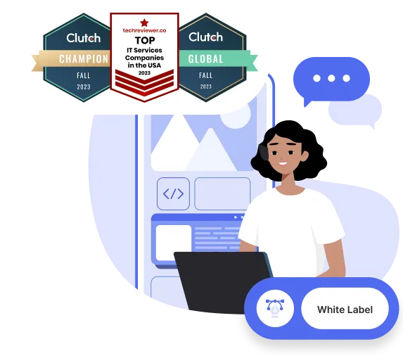
White space is among the most important concepts in layout design, yet still one of the most overlooked. A great color scheme and powerful alignment are important, but these elements can still look awful without the use of white space. In the same way, mediocre colors and design can be greatly improved through the proper use of white space.
Reasons to Incorporate White Space
Using white space is effective for the same reason it is difficult to implement – we want to fill blank space. As designers, we have to fight the urge to pack a page with elements. As readers, we see open spaces and our eyes want to keep looking until we find the next item. Having these areas of white space invites readers to explore the open spaces while also helping the page keep a neat, organized look.
Here are some more reasons to incorporate white space in your web design:
It Makes Your Call to Action More Prominent
In many cases, you’re asking your viewers to take the next step, whether that is to visit a store, buy a product, vote for a candidate, or change their habits. It’s difficult for your reader to know what to do, though, if they can’t find what you’re telling them to do.
Not if you use white space to make the answer really obvious.
For instance, is there any question what Google is asking you to do on this screen? Of course there are other options. You could log in or proceed to your Gmail, or peruse the tiny set of links tucked away at the bottom. However, the importance of the simplicity can’t be overstated. Their homepage found a way to abbreviate the message, “Welcome to Google; search for something!” That’s pretty remarkable.
Mozilla also utilizes this minimalist style to isolate their call to action. Even the browser window is empty! If I understand your message correctly, you want me to choose Firefox? Got it!
Another nice touch is the grey gradient in the background, which both highlights the “download” button and emphasizes the white tab at the top. That tab, when clicked, will lower and provide an abundance of information about Mozilla and its operations — creating easy access to information without drawing from the main message.
It Guides Your Reader Through the Page
Good web designers are manipulative.
You’ll often notice that white space is being used to direct your eyes to a certain area of a screen. You can’t help it; that’s just how it works. Utilize white space to help your reader navigate the page.
Mint’s homepage provides a nice use of white space to manipulate the fold. The designer knew they would be unable to get all the most important information at the very top, above the fold. As an alternative they offered bold statements in the slider that offer great reasons to use their service. Three icons and descriptions highlight the main features. Then, below that, there is a tremendous amount of white space, leading to more features. Remember how I mentioned a reader’s desire to fill space? We know something must be down there. It creates a sense of exploration, as the viewer feels compelled to see the rest of the page.
In a similar way, notice how Zurb provides an open, expansive feel, matching their marketing message: “Lead by design.” The text below immediately pulls your eyes down to more detailed print. With white space comes better readability and comprehension of the content you’ve provided.
It Creates a Classy, Elegant Look
In the early 2000s, web design trended towards flashy, extravagant designs that overpowered viewers. These days, design is much more about creating class and sophistication through simplistic designs.
And what better an example than Apple?
Apple is often cited as a design inspiration, and with good reason: everything from their products, to their packaging, to their website is engineered with sophistication in mind.
Oliver Harvey provides an excellent example from the intersection of the fashion and culinary world of white space that isn’t white. While the single picture dominates the visual, the entire page is built around the theme of black and white. This makes the red logo at the top of the screen the most prominent item, with a very limited amount of text on the page.
As an additionally nice touch, notice how the company’s trademark red also makes a cameo at the bottom of the image. Most of the other images that slide through also feature this same burst of color. This provides a sense of balance so the red logo doesn’t feel like it’s weighing down the top of the page, and it appears to reflect the logo.
It Helps Balance the Elements on Your Page
Something that may surprise inexperienced designers is the realization that “balance” doesn’t mean everything has to be equal. Social networking sites tend to be excellent examples of this since there is no telling what content will actually be posted.
The problem that social media platforms like Twitter face is that there is no way to really tell what kind of content will show up. It could be any combination of tweets, retweets, and images. While that could quickly turn into a design nightmare, Twitter addresses the problem by utilizing vast amounts of white space. Really, it’s almost all blank, especially as you scroll further down the page and the left and right columns fall away. There’s the light blue background, and then there are the white buffers around each element. However, because there is so much empty space, elements are balanced against each other, making their place on the page seem natural. It helps that Twitter keeps everything weighted towards the center of the page, too.
Instagram, on the other hand, has a consistent and easy shape to work with – square. But they handle it beautifully in their new desktop design, with a perfectly balanced grid of photographs coursing down the page.
How to Make the Best Use of Your White Space
Ok, so you know you need to use white space. But you’re also realizing it isn’t as easy as simply leaving the majority of the page blank. It takes careful skill and consideration. As you’re evaluating your use of white space in your own designs, here are some specific aspects to keep in mind:
Typography
Many modern website designs lead off with massive lines of text in the hero area. This can be done super well – Mint and Apple are great examples from above – but you need to make sure you balance the bold opening copy with sparse elements elsewhere on the page.
Copy
Use white space to break content into small, manageable chunks. Reading on the web can be taxing on the eyes, and readers won’t stick around for gigantic paragraphs. The use of empty space makes your text enticing.
Composition and Hierarchy
The hierarchy refers to the order in which viewers will view elements on your page, often determined by an item’s weight. Instagram weights all the photos on its profiles equally, while Iris Telehealth balances text on the left against image elements to the right.
Contrast
Consider that example from Oliver Harvey. It isn’t just the white space that is doing the job; it’s the stark contrast between the bright whites and reds used to accent the black. By giving us a mainly black background, the important elements naturally pop off the page.
Final Thoughts
White space isn’t just the absence of content or space you need to fill — it’s an active way to engage visitors with a website and a brand. It adds imagination about what a brand or business can do, and emphasizes what that business will provide. Elevate your design with the strategic use of white space.
What are your favorite examples of white space done right? Share them in the comments below!