Compare icon fonts vs SVG icons to choose the best option for website performance, scalability, accessibility, and design flexibility.
TL;DR
SVG icons are more flexible and reliable for most modern websites; icon fonts are best when many simple icons require minimal styling.
SVG icons support multiple colors, gradients, animations, and finer visual customization than icon fonts
SVG icons scale without quality loss and avoid the blurring issues that can affect icon fonts
Icon fonts can trigger flashes of incorrect characters or glyphs while font files are loading
SVG icons provide stronger accessibility and search-engine support through semantic elements and descriptive attributes
Icon fonts can still work well when a project uses many icons that require limited customization and styling
It’s hard to imagine modern web pages without these tiny but helpful elements – icons. You are sure to find them in navigation menus, contact details, product descriptions, etc. As an integral part of UI design, icons can also represent a challenge for developers.
An intense debate about icon fonts vs SVG fonts has been taking place for a while. Now, we’ll explore what icon fonts and SVG icons are, how you can use them, and which method you should prefer in particular situations.
What Are Icon Fonts?
Icon fonts, as the name suggests, represent fonts that contain icons instead of letters and numbers. Such icons include symbols and glyphs. As a rule, a set of icon fonts is stored in a font file.
Icon fonts were the de facto method of adding vector-based icons to websites until early 2020 when the real SVG support in different browsers became stable.
Why Have Icon Fonts Been Popular?
First, each character in icon fonts is scalable. Mainly, you can adjust icons with the help of CSS, modifying their size, color, and shape. You only have to create relevant classes in your CSS.
Second, the possibility to point to the font file lets designers use any font they wish without worrying if it is web-safe. Browsers request the indicated file and show the icon.
Third, icon fonts are small in size, and thus they can load quite fast.
While icon fonts have several considerable advantages, we should not disregard their disadvantages.
Reasons to Avoid Using Icon Fonts
First, we mentioned the icon fonts’ scalability. Indeed, it’s possible to change the font color and add a shadow to it, if necessary. Yet, remember that you can apply only one color to such icons. Being monochromatic and having style limitations are two of the cons that font icons may present for designers/developers.
As for the size, icon fonts design suggests a specific grid, such as 16×16, 32×32, 48×48, etc. Changing the grid can result in losing the quality of the icon.
Although you can adjust icon fonts for different viewport sizes, you should also remember to put them in aria classes to make them accessible to browsers.
Another problem that may arise with font icons is a flash of unstyled content (FOUC). To use icon fonts, you have to apply the @font-face rule, which instructs browsers to make an HTTP request for the font file.
While processing the HTML and the files linked to it, the browser builds the Document Object Model (DOM) in real time. Depending on the font file size, network conditions, and user’s hardware, it can take time to retrieve the font.
Until the browser is able to reach the font asset, it can display the textual HTML content before fully receiving it, which results in FOUC. Thus, there is a chance that random glyphs or characters will be shown instead of icons before the font is fully loaded. Such flashes can be irritating and impact user experience negatively.
What’s more, icon font files usually contain numerous elements, many of which you’ll probably not use. Yet, the file will take up the space.
What Are SVG Icons?
An SVG (scalable vector format) file, as the name implies, is an image format for vector graphics that features scalability. SVG files use XML-based markup language for describing vector graphics. In other words, SVG images are text-based and can function with CSS, JavaScript, DOM, etc.
Implementing SVG Icons
There are different ways of adding SVGs to websites. You can implement SVG icons either externally, as an image with the <img /> tag, or inlined in HTML.
External SVG Icons
To display an SVG icon, you should use the <img /> HTML element, similar to loading PNG, JPG, or GIF files:
This particular type of adding SVGs does not increase server requests and thus doesn’t affect the website’s performance negatively.
Benefits of Using SVG Icons
Let’s explore the main advantages of using SVGs on web pages.
Scalability
Unlike PNG or JPEG images, SVG icons are scalable, so your webpage will not suffer from a loss in quality when visitors use various devices to browse it.
Moreover, as browsers treat SVGs as images, there are no anti-aliasing rules for SVGs. Icon fonts, on the contrary, are vulnerable to these techniques and can look blurry. You can be sure that the visual quality of SVGs will be perfect in all resolutions.
Customization Options
SVGs are more flexible than icon fonts. First, you can add more colors with SVGs. Unlike single-color icon fonts, SVG icons allow for gradients. Furthermore, you can animate individual strokes in SVG icons.
Icon Positioning
Positioning an SVG vs icon font is simpler with SVG. To place an icon font, you might need to adjust various properties, such as word and letter spacing, alignment, line height, or font size. With SVGs, it’s enough to specify the size.
Fewer Server Requests
As we have already stated, specifying an icon font in CSS with the @font-face rule, you must indicate the URL where the font can be found. So, using the @font-face rule means instructing the browser to request the font file.
With SVGs, the crawler doesn’t have to send server requests to display the icon.
SEO Enhancement
Search engines can crawl and index SVG files. Built-in semantic elements, such as <title> and <desc>, make these files more accessible than icon fonts. It means that crawlers will understand better what your page is about.
Additionally, <alt> elements will be useful if some screen scanners cannot process icons properly. So, accessibility issues will be solved by displaying the alt name to visitors.
Creating and Adjusting SVG Codes
The latest versions of drawing programs, like Inkscape, Illustrator, and Sketch, produce pretty clean SVGs. Then, you can use any text editor to adjust an SVG code. Additionally, numerous online resources can help you.
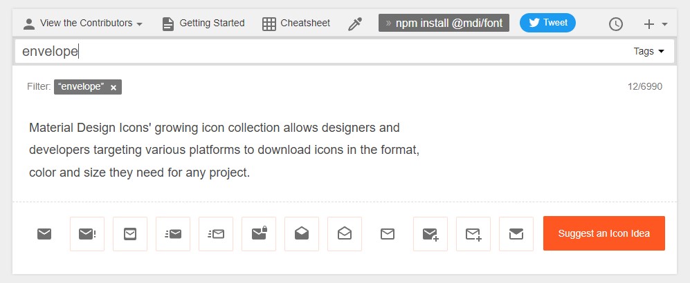
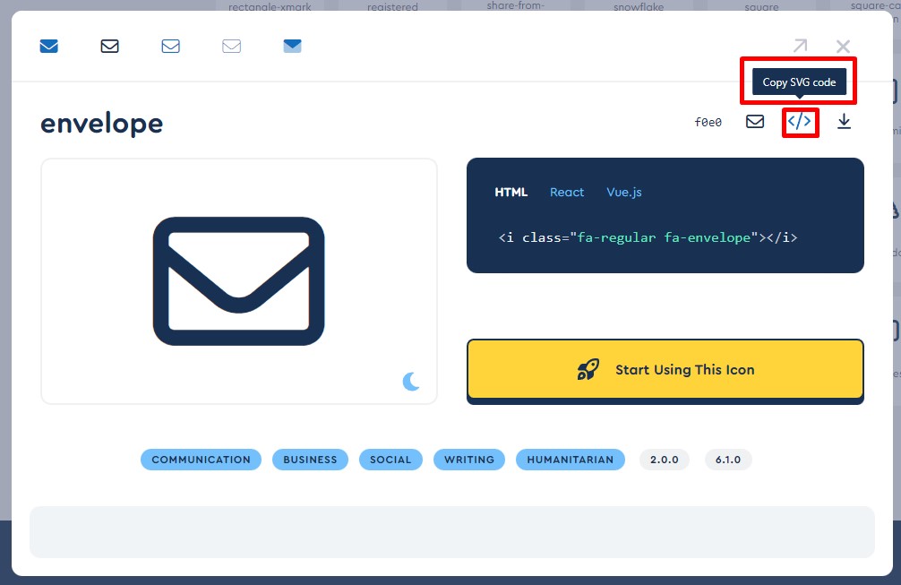
Here is a list of icon services that have SVG options:
Using these services, you can search for a necessary icon.
In some cases, you can also customize the size and color free of charge. Having made the necessary adjustments, you should copy the code or download the SVG.
Customizing the Code
After copying the code, we highly recommend checking it, keeping the compulsory elements, and removing any superfluous items. This will lead to a clean code and smaller file size. Let’s look at some examples.
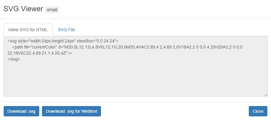
With the Material Design Icons, you’ll get such a code:
As you can see, this code contains credentials — a link to the FontAwesome website. There are other elements that you can find in SVG codes.
ID Attribute
Some software, like Illustrator, adds the ID attribute. If you use CSS and JavaScript, this attribute is helpful. Otherwise, it’s possible to remove it safely.
The x and y Attributes
In Illustrator codes, you can also find x=”0px” y=”0px” piece of coding. You can remove these attributes, too.
Enable Background and xml:space=”preserve” Attributes
As browsers don’t support these attributes, you can leave them out.
Several online tools can assist in removing the unnecessary coding:
svgoptimizer is an instrument that helps to optimize multiple icons at once.
Summing Up
Icon font vs SVG comparison shows that SVGs are more reliable, scalable, and rendered faster. That is why SVGs are becoming the new standard of web icons and a W3C Recommendation.
Here are some tips on what icons to choose.
If you need many icons without much style modification, icon fonts can work well for you. For customization and animation, it’s better to use SVGs. This is especially true if you require full control over colors, smooth transitions, and animation of various icon parts.
You can use inline SVGs if there is not a multitude of icons that should be rendered on a single page.
Inline SVGs add some coding to your files, so if you don’t mind this, feel free to use them.
SVG icons will look perfect both on regular and retina displays. If this factor is important, you should prefer inline SVGs to font icons.
Accessibility support is better with SVG icons. So, if accessibility is a must for you, choose inline SVGs.
Superb Web Development Services from GetDevDone
GetDevDone has been at the forefront of the web development industry for almost 17 years.
SVG icons are usually the better choice for modern websites, but not because icon fonts are unusable. SVGs give developers more control over rendering, color, animation, positioning, and accessibility, which matters more on responsive websites with varied layouts and screen densities.
Icon fonts can still work for simple, monochrome icon sets, especially if the site already uses a stable library and the icons do not need much customization. The problem is that icon fonts treat icons like text, so developers often have to manage font loading, alignment, accessibility labels, and unused glyphs. SVGs behave more like actual graphics, which makes them easier to control in most production builds.
The practical rule: use SVGs for new builds unless there is a clear reason to keep an existing icon font system.
Icon fonts still make sense when a website needs a large set of simple, single-color icons and the design does not require detailed styling, gradients, animation, or per-icon changes. They can also be acceptable when an existing website already has a well-maintained icon font setup and replacing it would create more risk than value.
The stronger use case is usually consistency, not flexibility. If the icons are purely decorative, loaded reliably, and hidden correctly from assistive technologies when needed, an icon font can be good enough.
Where icon fonts become weaker is in modern design systems. Once icons need multiple colors, stroke-level animation, precise alignment, accessible names, or different behavior across components, SVGs tend to be easier to maintain.
The main risks of icon fonts are visual inconsistency, font loading issues, accessibility mistakes, and unnecessary payload. The article mentions several practical problems: icon fonts are usually limited to one color, can lose sharpness when forced outside their intended grid, may flash as missing glyphs before the font loads, and often include many unused icons.
On a production website, those are not just technical details. A missing or delayed icon font can make navigation, buttons, or form cues look broken for a moment. Accessibility can also suffer if screen readers encounter meaningless glyphs or if meaningful icons are not paired with readable labels.
The risk is highest when icons are used as functional UI signals, not just decoration. For example, a search icon, cart icon, menu icon, or error indicator should not depend on a fragile implementation that becomes unclear if the font fails or loads late.
SVG icons should be added inline when the icon needs direct styling, animation, accessibility metadata, or component-level control. External SVG files are better when the icon is static, reused as a normal image, and does not need its internal paths or strokes styled from the page.
Inline SVGs are useful for interface icons inside buttons, navigation, cards, accordions, and reusable components. Developers can control fills, strokes, hover states, and labels directly in the markup or component. The trade-off is that inline SVG adds code to the page.
External SVGs keep templates cleaner and can be cached like other image files, but they are less flexible. For production work, the choice should be made by usage pattern: inline for controlled UI components, external for simple static assets.
Yes, too many inline SVG icons can hurt maintainability and may increase page weight if teams paste repeated SVG code directly into templates or CMS fields. Inline SVGs reduce extra image requests, but they also add markup to the HTML. If the same complex icon appears many times, that markup can become noisy and harder to manage.
The better pattern is to centralize the icon system. In front-end development work, that can mean reusable components, SVG sprites, a controlled icon library, or CMS fields that output approved icons instead of random pasted code.
For agencies, this matters during handoff and post-launch support. A messy icon implementation can make later client revisions slower: one color change or accessibility fix may require editing dozens of scattered SVG blocks. Inline SVG is useful, but it should be treated as part of the front-end system, not as disposable decoration.
SVG icons are usually easier to make accessible than icon fonts, but they are not automatically accessible. The advantage is that SVGs can carry meaningful text alternatives through accessible names and descriptions, while decorative SVGs can be hidden from assistive technologies when they add no information.
Icon fonts need extra care because the icon is technically a font character. If it is exposed incorrectly, a screen reader may announce something meaningless or confusing. If the icon is decorative, it should usually be hidden from assistive technologies. If it carries meaning, the surrounding control needs a clear accessible label.
The key distinction is not “SVG equals accessible” and “icon font equals inaccessible.” The real question is whether the implementation tells assistive technologies what the icon means, or whether the icon should be ignored completely.
Designers should hand off SVG icons as a clean, consistent icon set, not as random exports from different tools. Developers need predictable files, consistent sizing, and enough context to implement icons without guessing.
A useful handoff should include:
final SVG files or a clearly organized design file
consistent viewBox and icon dimensions
agreed stroke widths, fills, colors, and hover states
notes on which icons are decorative and which carry meaning
naming that matches the UI purpose, not vague labels like icon-1 or shape-final
no hidden layers, unused masks, or accidental export artifacts
In agency workflows, this is where small problems become delivery friction. A weak icon handoff can slow QA, create inconsistent component states, or force developers to clean every file manually. For design-to-code work such asFigma to HTML, icon preparation should be part of the handoff checklist, not a late cleanup task.
SVG code should be cleaned of unnecessary editor output, duplicate attributes, unused metadata, and anything that makes the file larger or harder to reuse. The article gives common examples: IDs that are not referenced by CSS or JavaScript, x and y attributes that are not needed, enable-background, xml:space, and tool-generated comments or credentials.
Developers should be careful not to remove code blindly. Some IDs, masks, clip paths, gradients, or ARIA references may be required for the icon to render or remain accessible. The safest approach is to optimize the SVG, test it visually, and test any interactive or accessible behavior afterward.
For reusable icon systems, cleanup is not just about file size. Clean SVGs are easier to theme, animate, audit, and maintain across templates, CMS blocks, and component libraries.
Replacing an existing icon font library with SVG icons is worth considering when the current setup causes visible rendering issues, accessibility concerns, performance problems, or design limitations. It is not automatically worth doing just because SVGs are the newer default.
For a stable site with simple monochrome decorative icons, a full replacement may be low priority. The better first step is to audit where icons are used and identify the risky cases: navigation icons, buttons, form states, error messages, cart icons, account icons, or anything that carries meaning without nearby text.
A practical migration can be staged. Keep low-risk decorative icons for later, replace functional icons first, and create a reusable SVG pattern before touching dozens of templates. That is usually safer than a broad refactor that changes every icon at once and creates avoidable QA work.
Compare dedicated development teams vs. freelancers for agency web delivery. See where each model fits, trade-offs, coordination, QA, cost, and support.
Compare the best headless CMS for React: Storyblok, Sanity, Hygraph, Strapi, Contentful, Prismic, and more with features, use cases, and selection criteria.